This week I have gotten the results from my development part of this porject and now I want to focus more on what I could have done and how is the final product of my project.
I have answered these questions through out my project, however I would like to take another view and look at it again
1. How effective is the final piece?
I find the final piece to be very effective in showing concentrated information, empathetic, authentic and passionate look and feel and a real winner for standing out and promoting the 15 below jacket.
It displays the information to donate quickly and it doesn't take long to get to grips with what the 15 below project is about or on how to help them, by downloading my media. In this respect I have created a very friendly donation system that anyone can use since money is not an issue here.
This site or at least the concept is a winner through and through.
2. Does the Final Piece match the brief?
It does in all aspects, it has learning, a fund raising idea, a multitude of media to access, the 15 below logo on every page, a link to the original site on every page, I added one colour to the colour scheme and interactivity throughout.
Also it goes beyond the brief including non essential materials into the site such as wallpapers, an animation a multitude of audio components and I have hosted it live which was not suggested in the brief.
3. Is there any thing I would change about the design?
I would have changed the container it is in, possibly to either take it away and have it all on a blue background or change the shape of it, however I think this one encompasses what I set out to reach fromt he start. Also I would like to have added mroe wallpapers in that section however the original extras I made I have lost, but I might end up making new ones if I have time.
4. Why did I choose this design solution?
In the end I made 5 versions of my idea, I moved back and forward testing each one in aesthetic look and I finally came to the decision of a V3 modified which is the final piece I have shown. I chose it because evrything merges well, I design ed tghe 15below jacket myself in illusstrator, unknowing it would affect my whole design.
What I mean by this is I tried to make it more shiny and photo realistic after this and it just didnt work together, I later figuired out it was my jacket and background that were doing it, so I made new buttons in illustrator and a background in photoshop and it worked instantly.
It fits the brief, im happy i made it, Thats why I chose this solution
See here
5. What difficulties did I find and overcome?
The first major one was the Flash menu bar I could not integrate it into my design as it only worked in firefox, i since solved this by redoing my menu with roll over images a change Im happy off since it was then that I realised I had to change my menu button icons that i mentioned earlier.
I also found little things like transparency issues, layout shifting and such but I solved that with discussion to my human resources and online searching or related issues. There was one other issue of compatibility issues between my laptop and the macs in college which in some cases were unavoidable but most I fixed with simple cleaning of the code.
6. What are the Strengths and Weaknesses of this product?
The main strengths I think is that it looks crisp, and pops out at you, and that it gets the information across very quickly as there is not a lot of reading required.
Also the fund raising idea probably the biggest strength as it doesn’t require people to actually pay money to this charity to get credit to make the jackets its totally self efficient and could easily be modified to include other media at any time.
Another strength for my personal reasons is that all design was made by me, no stock photos, no copied code, all downloadable media, it was all from the ground up created by me and I’m very proud of that.
The other strengths lay in the construction of the site, it’s all named correctly no AP divs named from AP div 1 - 33 or anything like that, and it’s all professionally done. Also the colour scheme fits in well with what 15 below are trying to express about the homeless situation, they need help to stop people dying from the cold, and they need it now.
Also I have delved into other areas of design that could be applied if I had more time to do it, I made numerous Audio tracks to be laid into the site, unfortunately it would be impractical in this site as the music would have to be clicked to play on every page from the beginning, and also the flash elements.
The main weakness I would have to say is there isn’t any, there may be design issues or different perspectives but in terms of it, without thinking of what else could be done to it, it’s perfectly fine.
7. What would I change if anything about the product?
Well after a long consideration, nothing. This is because of the results of my questionaire and I am happy with the results
8. What would I change about the way Ive handled this project?
Nothing, Ive handled it better I think than anyone that was doing this project, I have diaries, I have ablog, I had questionaires, I researched a lot and have applied it too the design of the final peice, and I now have my own site with this blog and piece linked to it. I have even deleved into other possible areas of ideas. I have done a lot.
My site
9. In what way have my skills improved?
I have done graded units since I first entered college, and so the concept is not new to me, however this is the first one that has been visual orientated and so It was my first sketchbook project and I enjoyed working with it, unfortunatly my drawing skills were not top standard and I would liek to correct it by seeing what is top atandard and in that thought It would have been nice to see what what top standard throughout the project.
Also I have improved in Dreamweaver, Photoshop, Flash, Illustrator, Reason and Audacity the programs I used int his project, I have gained more confidence in using them since this project started even tho most of them I've only come to grips with this year.
I also saw new ways to do projects, like this blog for instance I never used them before This project willingly. Its great I find for projects as its easy accessable and anyone can see exactly how your projects doign without needign to meet you.
But the biggest part of my that has improved is my understanding of the whole design process, I have a much bigger appreciation of how an idea is formed and If I had known now what I knew when I did Higher Art I would have passed with flying colours, enjoyed it much more and maybe even had a differebnt mind set on everythign after that.
The whole prospect of these graded units is very exciting hte expanding of thoughts and minds and I look forward to my next project eager to improve in every way.
Thanks for reading I hope you enjoyed my project.
My site
Final Piece
Wednesday, 27 May 2009
Sunday, 24 May 2009
My own Space
As I have put the 15 below project microsite up online, I took this opertunity to make my own site, and I have. Although unfinished it still has most of its pages up, I hope you enjoy it :)
My site
It links my projects together and will soon link this to it aswell.
My site
It links my projects together and will soon link this to it aswell.
Final Piece moved
Here is my Final piece hosted at the new location:
15belowproject
It was moved to a more logical loaction, shrinking the link.
I hope you enjoy my end piece
15belowproject
It was moved to a more logical loaction, shrinking the link.
I hope you enjoy my end piece
Sunday, 17 May 2009
week 11
1. What was in your plan for this week?
This week was the second last week of work before the development hand-in. I planned to create a proper working animation download button and just tweak the micro site.
I also planned to prepair the presentation by emailign david about the white board and a way to hold my A3 sketchs for presentation. I also planned to add a footer with the link to the main site.
Also removing the white top bar and moving the title into the main container for a mor streamline look. Also I added meta tags for a search engine to easily find it but I need mroe help in that matter I believe.
Later I decided after failing expectations to buy webspace for myself and use that to host the microsite and then direct my testing towards the site.
This is located at http://www.geokda.co.uk/15below/CSS/index.html
I also planned to print the final product and the other final versions onto A3 boards for the presentation purpose, to clearly show each page in a way where you can see everything at once.
Following mounting all my palnning and development work onto A3 card, I designed a front cover which in itself is nice but I migth include a more flowing feel as it doesnt look like its part of the project as of yet.
Next was to put all the text documents onto the USB and possibly print it off, but to save paper I will likely just put it in the USB under presentation/testing.
After considering how I would present my comments I wrote them down in word and began to write my questionaire which was my way of testing the website, I did it this way instead of directing the viewer what to do because if the website is interestign enough they will explore it themselves :) and answer questions on it later, if they dont answer soem of them then my design is flawed.
2. What did you actually do this week?
Everything I planned to do from the beginning happened accordingly, apart from the meta data I researched and input into the website has yet to work, I even had problems on another computer finding the site.
I also had a few problems in communication getting prints and webspace but ive taken it into consideration and come out with new options, still I would have liked to have had the printing done this week however it has not been possible.
3. If there are any differences between items 1 & 2, please explain why.
A few but thats all part of planning ahead and have plan B ready and in place.
Just to note I wanted the prints donr this week but I couldnt as I did not get the time required to talk over the principles between printing out a website, so I print screened them and sized them all into 2 variations, one screenshot per A3 and a combo of 4 per A3, ready to be printed next week.
I wish the meta data worked however it doesnt and I will need to proclaim that it should be fixed with more time.
4. What worked well this week?
The final product is very good in all aspects, im glad to have it done with all the tweak variations and the presentation is looking well organised although I should like to prep for questions directed at my work which I have yet to do.
5. What did not work so well this week?
Communication, creative enviroment would have helped my flow a bit better too.
The monotony of creative people in the college wears at me a little, but more so the standard of willingness to aspire, it seems Britain has come down with some sort of virus affecting peoples motivation to succeed I extend this theory to the new generations mainly. I have often wondered about changing the schooling system here, maybe it will help.
I attribute this state to lack of discipline and state of mind, in which you would normally be aware of scoiety, the world around you the politics the economics, but it isnt there in most here, they just go about talking about the same stuff over and over again. Unwilling to reach higher than what they can reach at the moment a small comfort of feeling in control and meaningful, however I am possibly too harsh.
6. What have you learned this week?
People shouldn't underestimate the amount of work it takes to build a website from scratch. Once you have learned it it may be easy, but this is my first full blown project of any design standard in years, a new challenge for me and it does take planning to achieve the goal I want. And I will.
7. Describe all the items that have been added to your portfolio this week.
The final product on line, ready to be printed sheets of the final product and variations and also all my work mounted ready for presentation.
8. Do you have any other comments to make?
I wish I had feedback on this blog that I could respond to or some constructive criticism.
It often helps me being subject or scrutiny rather than handing not getting any feedback as I work through a project and I think its crucial to have this in place, however this is a graded unit assignment and I must follow its rules accordingly
If you, anyone, would like some visuals of my planned please just ask and I will see if I can part with some of it.
Wednesday, 13 May 2009
Final Piece
Here is my Final piece hosted at:
15belowproject
It is there that I will ask people to navigate towards to answer my questions on navigation/useability/thoughtfulness/design etc
I hope you enjoy my end piece
15belowproject
It is there that I will ask people to navigate towards to answer my questions on navigation/useability/thoughtfulness/design etc
I hope you enjoy my end piece
Sunday, 10 May 2009
week 10
Today marks my approval of the latest version of the microsite :)
1. What was in your plan for this week?
This week I ahd planned a lot of things mainly because I wanted this week to be the last week of the buildign of the website. I planned to concentrate on background design and layout in doing this I captured a sky screen that looked like a great background.
Also I planned to create the Flash animation this week doing the first animation from the storyboards I planned to do in my research pre development.
From then on I had arranged to discuss the changes with david in regards to the flash menu incompatibility issues and picking up the animation designs instead so not too loose my workload.
I planned after the animation design to incorporate the design into the background design and or button design which would hopefully lead onto the final design.
Next I planned to create more Audio tracks to use in the microsite, one more intune with the maturer audio fans and one with the competitive media market genres. Also installing the photograph as the wallpaper should provide an incentive to what menu icons i should use V3 or V4.
After seeign that I could not install a player that would play a track continuously throughout page changes I planned to scrap it but still develope the audio ideas so I could in theory attempt to use them if I had more time.
Nearing the middles of the week I endevoured to remake V3 as V4 was not working out, I chose this option because V3 has the most solid design, is flexible and as close to my original thought as it is. Except I expanded out of the container but that is what will always happen when you plan outwith design and testing.
The button I used in V3 and V$ look too much like buttons and hence require a grounding, That is why I have been havign trouble I believe, so I'm planning to remake some not so shiny.
Also I could not makethe original animation as my Flash could not work on my laptop so I developed a newer one less complicated but using both ideas in this design. From this I managed to come up with menu button designs which worked perfectly with the background I had originally for V3.
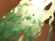
Finally I have planned to incorporate the animation into the microsite and the new menu buttons in th edesign and Also I developed my new floatign jacket with extra animation to make it look more interestign and contemporary.
As from now on I plan to Test my site by hopefully putitng it up live either by buying my own spare or asking the college to fund it for all the class. Interestingly I also planend to get a board and printing access for the presentation which I plan to do next week with the testing.
2. What did you actually do this week?
Everything I planend to do fromt he beginning happened accordingly, apart frotm he audio aspects which I had to re-adjust my plans to not include them in the final design but I will hopefulyl fit them into the presentation as an 'I could do this with more time' part.
Also I spend a lot of time more so on the menu button design and audio aspects that I should have, but int he end I'm very gratful for my conviction because I managed to burn through the night and gain a product I would be happy to submit as the graded unit final.
3. If there are any differences between items 1 & 2, please explain why.
Plan A is always have a Plan B, When somethign changes have a plan and thats what I did, The audio could nto be intergrated because the design for it would require me to rebuild my entire design.
4. What worked well this week?
The final product is very good in all aspects, im glad to have it done
5. What did not work so well this week?#
The social jsutice project is leaning on me too much, that sall i can say with short time.
6. What have you learned this week?
Simple is often the key.
7. Describe all the items that have been added to your portfolio this week.
Nearly a Final draft of the microsite and a new animation.
8. Do you have any other comments to make?
None atm, as I have 1 minute atm to post this, have a good day :)
If you, anyone, would like some visuals of my planned please just ask and I will see if I can part with some of it.
1. What was in your plan for this week?
This week I ahd planned a lot of things mainly because I wanted this week to be the last week of the buildign of the website. I planned to concentrate on background design and layout in doing this I captured a sky screen that looked like a great background.
Also I planned to create the Flash animation this week doing the first animation from the storyboards I planned to do in my research pre development.
From then on I had arranged to discuss the changes with david in regards to the flash menu incompatibility issues and picking up the animation designs instead so not too loose my workload.
I planned after the animation design to incorporate the design into the background design and or button design which would hopefully lead onto the final design.
Next I planned to create more Audio tracks to use in the microsite, one more intune with the maturer audio fans and one with the competitive media market genres. Also installing the photograph as the wallpaper should provide an incentive to what menu icons i should use V3 or V4.
After seeign that I could not install a player that would play a track continuously throughout page changes I planned to scrap it but still develope the audio ideas so I could in theory attempt to use them if I had more time.
Nearing the middles of the week I endevoured to remake V3 as V4 was not working out, I chose this option because V3 has the most solid design, is flexible and as close to my original thought as it is. Except I expanded out of the container but that is what will always happen when you plan outwith design and testing.
The button I used in V3 and V$ look too much like buttons and hence require a grounding, That is why I have been havign trouble I believe, so I'm planning to remake some not so shiny.
Also I could not makethe original animation as my Flash could not work on my laptop so I developed a newer one less complicated but using both ideas in this design. From this I managed to come up with menu button designs which worked perfectly with the background I had originally for V3.
Finally I have planned to incorporate the animation into the microsite and the new menu buttons in th edesign and Also I developed my new floatign jacket with extra animation to make it look more interestign and contemporary.
As from now on I plan to Test my site by hopefully putitng it up live either by buying my own spare or asking the college to fund it for all the class. Interestingly I also planend to get a board and printing access for the presentation which I plan to do next week with the testing.
2. What did you actually do this week?
Everything I planend to do fromt he beginning happened accordingly, apart frotm he audio aspects which I had to re-adjust my plans to not include them in the final design but I will hopefulyl fit them into the presentation as an 'I could do this with more time' part.
Also I spend a lot of time more so on the menu button design and audio aspects that I should have, but int he end I'm very gratful for my conviction because I managed to burn through the night and gain a product I would be happy to submit as the graded unit final.
3. If there are any differences between items 1 & 2, please explain why.
Plan A is always have a Plan B, When somethign changes have a plan and thats what I did, The audio could nto be intergrated because the design for it would require me to rebuild my entire design.
4. What worked well this week?
The final product is very good in all aspects, im glad to have it done
5. What did not work so well this week?#
The social jsutice project is leaning on me too much, that sall i can say with short time.
6. What have you learned this week?
Simple is often the key.
7. Describe all the items that have been added to your portfolio this week.
Nearly a Final draft of the microsite and a new animation.
8. Do you have any other comments to make?
None atm, as I have 1 minute atm to post this, have a good day :)
If you, anyone, would like some visuals of my planned please just ask and I will see if I can part with some of it.
Saturday, 9 May 2009
new buttons design

This is taken from the design research of the PSP skins and of the Xbox 360 background, all in all circles are widely used in northern american design.
There is one difference from my final design is that I would like on the alt buttons for the dots to move, slightly.
Subscribe to:
Posts (Atom)